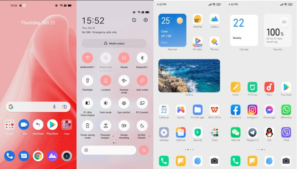
Realme UI 3.0 Vs MIUI 13 – Which UI Features is Best Realme or Redmi?: We’ll compare the characteristics of MIUI 13 and Realme UI 3.0 in this article. We’ll figure out which user interface is best for everyday use. Realme UI and MIUI have the same simple stock design and many of the same functions. Realme UI 3.0 is the next generation of Realme UI 2.0, and MIUI is the future generation of MIUI 12. Both custom UI based on Android 12 and Realme UI 3.0 are the next generation of Realme UI 2.0, and MIUI is the next generation of MIUI 12.
Xiaomi, POCO, and Redmi smartphones run on MIUI, whereas Realme smartphones run on Realme UI. The primary points of comparison will be the user interface, features, customization choices, and the theming engine. Let’s compare the two Android skins to see which one is superior.
Comparison Between Realme UI 3.0 and MIUI 13
Both Realme UI 3.0 and MIUI 13 have advantages and disadvantages, with MIUI receiving more functionality. If you want to learn more about the features that will be included in Realme UI 3.0, go to Features to Expect in Realme UI 3.0. And also if you want to know about Realme UI 4.0 Features and Launch Date.
User Interface
You’ll notice a considerable difference in the user interfaces of MIUI 13 and Realme UI 3.0. Realme’s UI is gradually resembling that of vanilla Android. In comparison to vanilla Android, the settings menu, notification panel, toggles, and app drawer have essentially no modifications.
The user interface of MIUI has been updated. Throughout the UI, there are design aspects that are similar to those found on iOS. The notification panel is the sole drawback to MIUI. It’s not as compatible with Android’s design as the others, and it’s less functional.
Options for Customization
Realme UI and MIUI may be customised in a variety of ways. Let’s have a look at MIUI first. From the settings, you can alter the home screen layout, transition effects, and home screen layout, as well as the launcher. You can disable the home screen mode, app launch and animations, layout, gestures, and the double-tap option to lock the phone. It’s also possible to alter the colour temperature.
Theme Generator
In this case, Realme UI and MIUI go hand in hand. Realme UI’s global store includes a good selection of themes, wallpapers, and fonts. You may change the backgrounds, app icons, and overall UI of the home screen using an install button. MIUI, on the other hand, has the largest theme store and a vibrant theming community on the global editions.
Multi-window and gestures
Navigation functions have been introduced to both Realme UI and MIUI. MIUI offers three options: conventional Android buttons, switching back/multitasking, or using Android gestures. The MIUI multitasking menu is a vertical scrolling card-based interface that allows you to view and interact with up to four apps at once.
Other Inventive Features
On the side drawer of the Realme UI, there is a Smart Assistant function. Realme has two useful additions: quick functions and favourite contacts. With only a swipe from the home screen, you may access vital features like a translation, Google search, scanner, or any app.
Calling a cab, cleaning cache, installing apps with an one tap, checking PNR, and more smart action shortcuts are available in MIUI. Calendar events, cricket scores, a Twitter feed, and other widgets are included in the list.
Realme UI 3.0 vs MIUI 13 Conclusion
The differences between MIUI 13 and Realme UI 3.0 are numerous, making it difficult to choose one over the other. MIUI features a multitasking menu and improved gestures, whereas Realme UI has sidebar functionality, a better look at the user interface, and smart driving. What are your thoughts on each of these features? Which one do you prefer: MIUI 13 vs Realme UI 3.0?


